Table of contents
When building a web application, toggling an element is one of the key features you are likely to come across and may need to implement in your project.
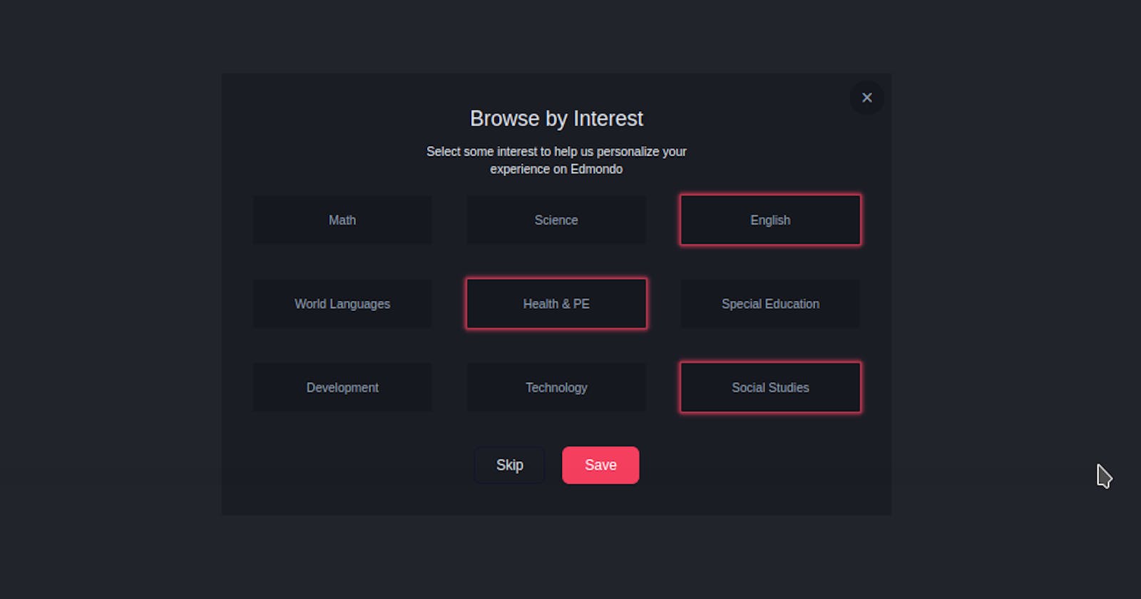
There are various ways you can toggle an element. In this section, we will be working on a multi-toggle component. That's we will be able to toggle the design of multiple elements in a structure.
Without wasting too much time, let's get started

Understanding the Task
We will be building a multi-toggle component, we can toggle or select multiple elements. For this exercise, we will be using TailwindCSS and a small piece of JavaScript. This session will be very short and straightforward.
Structure of Code
Our code root code is still the same as in all our tutorials.
<body>
<!-- First Layer -->
 <div>
<!-- Second Layer -->
  <div>
        <!--
              Here Goes the content
          -->
  </div>
 </div>

</body>
We will be building this component as one, all the different categories will be inside a big container and general styling will be added to them from the parent container as follows
 <div>
                    <!-- Header -->
    <div class="text-center mb-5">
         <h2 class="text-2xl mb-3">Browse by Interest</h2>
         <p class="w-[80%] sm:w-[50%] text-sm mx-auto">Select some interest to help us personalize your experience on Edmondo</p>
    </div>
                    <!-- Categories -->
    <div class="grid grid-cols-2 md:grid-cols-3 gap-4 sm:gap-10 mb-10 [&>*]:px-4 [&>*]:h-14 [&>*]:flex [&>*]:items-center [&>*]:justify-center [&>*]:bg-[#16181f] [&>*]:border-2 [&>*]:border-[#171920] [&>*]:text-xs [&>*]:sm:text-sm [&>*]:text-slate-400 [&>*]:rounded-sm [&>*]:cursor-pointer [&>*:hover]:border-rose-500 [&>*:hover]:shadow-[0rem_0rem_0.3rem_0.2rem_rgba(244,63,94,0.8)] [&>*:hover]:text-slate-100">
                <div class="element">
                    <h2>Math</h2>
                </div>
                <div class="element">
                    <h2>Science</h2>
                </div>
                <div class="element border-rose-500 shadow-[0rem_0rem_0.3rem_0.2rem_rgba(244,63,94,0.8)] text-slate-100">
                    <h2>English</h2>
                </div>
                <div class="element">
                    <h2>World Languages</h2>
                </div>
                <div class="element border-rose-500 shadow-[0rem_0rem_0.3rem_0.2rem_rgba(244,63,94,0.8)] text-slate-100">
                    <h2>Health & PE</h2>
                </div>
                <div class="element">
                    <h2>Special Education</h2>
                </div>
                <div class="element">
                    <h2>Development</h2>
                </div>
                <div class="element">
                    <h2>Technology</h2>
                </div>
                <div class="element border-rose-500 shadow-[0rem_0rem_0.3rem_0.2rem_rgba(244,63,94,0.8)] text-slate-100">
                    <h2>Social Studies</h2>
                </div>
 </div>
To the header of this design, we applied some basic stylings font-size of text-2xl for the topmost header and text-sm for the lower header
The majority of the styling was applied to the different categories. To apply general styling to the different categories from the parent container, we made use of the [&>*] property of TailwindCSS.
The property [&>\]* simply means “select each child individually”, this allows us to apply the same styling properties to all the immediate children.
To each of the different categories, we gave it a padding-inline of px-4 and a height of h-14. We gave each of them a display of flex and centered their content by using flex items-center justify-center. We also gave them background-color of bg-[#16181f], a border-width, border-radius and color of border-2 border-[#171920] rounded-sm respectively. Each of these categories has a hover effect of [&>*:hover]:border-rose-500 [&>*:hover]:shadow-[0rem_0rem_0.3rem_0.2rem_rgba(244,63,94,0.8)] [&>*:hover]:text-slate-100
Trust me, that's pretty much it for the Styling, and the UI of our component.
The whole code looks like this
<body class="bg-[#22242c] flex justify-center items-center min-h-screen">
<!-- First layer -->
<div class="bg-[#1b1d25] w-full sm:max-w-3xl py-9 px-9 text-slate-200 relative">
<!-- Close icon -->
<div class="absolute top-2 right-2 w-10 h-10 rounded-full text-2xl bg-[#16181f] text-slate-400 flex items-center justify-center cursor-pointer hover:text-slate-100 ">
×
</div>
<div>
<!-- Header -->
<div class="text-center mb-5">
<h2 class="text-2xl mb-3">Browse by Interest</h2>
<p class="w-[80%] sm:w-[50%] text-sm mx-auto">Select some interest to help us personalize your experience on Edmondo</p>
</div>
<!-- Categories container -->
<div class="grid grid-cols-2 md:grid-cols-3 gap-4 sm:gap-10 mb-10 [&>*]:px-4 [&>*]:h-14 [&>*]:flex [&>*]:items-center [&>*]:justify-center [&>*]:bg-[#16181f] [&>*]:border-2 [&>*]:border-[#171920] [&>*]:text-xs [&>*]:sm:text-sm [&>*]:text-slate-400 [&>*]:rounded-sm [&>*]:cursor-pointer [&>*:hover]:border-rose-500 [&>*:hover]:shadow-[0rem_0rem_0.3rem_0.2rem_rgba(244,63,94,0.8)] [&>*:hover]:text-slate-100">
<div class="element">
<h2>Math</h2>
</div>
<div class="element">
<h2>Science</h2>
</div>
<div class="element border-rose-500 shadow-[0rem_0rem_0.3rem_0.2rem_rgba(244,63,94,0.8)] text-slate-100">
<h2>English</h2>
</div>
<div class="element">
<h2>World Languages</h2>
</div>
<div class="element border-rose-500 shadow-[0rem_0rem_0.3rem_0.2rem_rgba(244,63,94,0.8)] text-slate-100">
<h2>Health & PE</h2>
</div>
<div class="element">
<h2>Special Education</h2>
</div>
<div class="element">
<h2>Development</h2>
</div>
<div class="element">
<h2>Technology</h2>
</div>
<div class="element border-rose-500 shadow-[0rem_0rem_0.3rem_0.2rem_rgba(244,63,94,0.8)] text-slate-100">
<h2>Social Studies</h2>
</div>
</div>
<!-- Navigation Buttons -->
<div class="flex gap-5 justify-center [&>*]:px-6 [&>*]:py-2 [&>*]:border [&>*]:rounded-lg [&>*]:cursor-pointer">
<div class="border-slate-900 hover:bg-slate-800 hover:text-white">
<h2>Skip</h2>
</div>
<div class="border-rose-500 bg-rose-500 text-white hover:text-rose-500 hover:bg-transparent">
<h2>Save</h2>
</div>
</div>
</div>
</div>
<script src="index.js"></script>
</body>
It is worth mentioning that we gave every category a custom class = "element", this is the class we will use to add the toggling effect to the different categories.
JavaScript
The JavaScript here is mainly to add a toggling effect to the different categories when clicked.
const elem = document.querySelectorAll(".element");

console.log(elem);

elem.forEach(item => {
    item.addEventListener("click", ()=> {
        item.classList.toggle("shadow-[0rem_0rem_0.3rem_0.2rem_rgba(244,63,94,0.8)]");

    })

})
We started by selecting all the node elements having the class="element" using the document.querySelectorAll(".element") method and store them in the constant elem.
elem is now a nodeArray having all the different categories.
Using the forEach method in this array, to each of these categories, we applied an on-click event to it, such that when clicked, the shadow-[0rem_0rem_0.3rem_0.2rem_rgba(244,63,94,0.8)] is toggled.
And that's pretty much it for this tutorial session.

Conclusion
We just built a Help Center Component 🤩. And I bet you realized it was very easy than we thought in the beginning 😏.
You can have a Live preview on Codepen or find the code on GitHub
Don’t hesitate to share with me if you were able to complete the tutorial on your end, I’d be happy to see any additional component and styling you added to your work
If you have any worries or suggestions, don’t hesitate to bring them up! 😊
See ya! 👋
