

A tooltip is a graphical user interface (GUI) element used in conjunction with the cursor or mouse pointer to display information about an item without needing to click on it.
Being one of the most popular on-screen elements of onboarding and user engagement, websites and apps can feature simple tooltips, series of tooltips, single tooltips, or tooltips as interactive elements of a user journey.
Tooltips have a wide range of use cases, and they can be adjusted to each use case depending on their purpose.
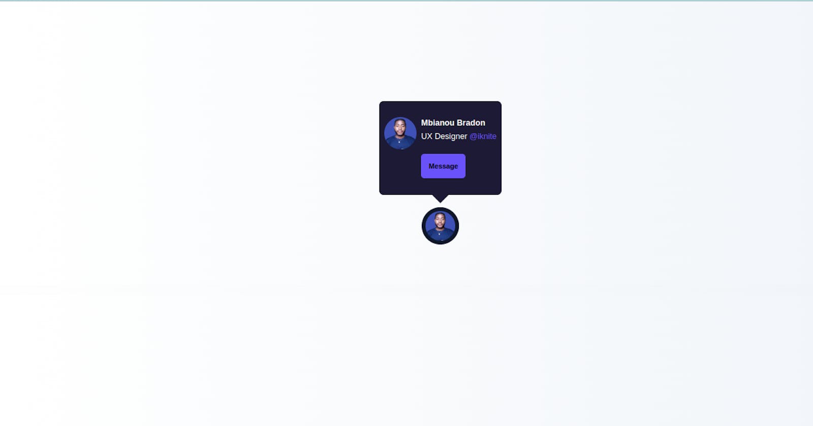
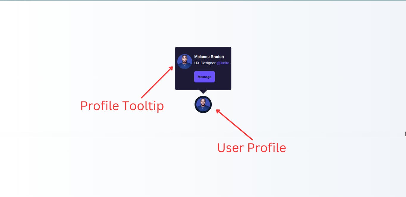
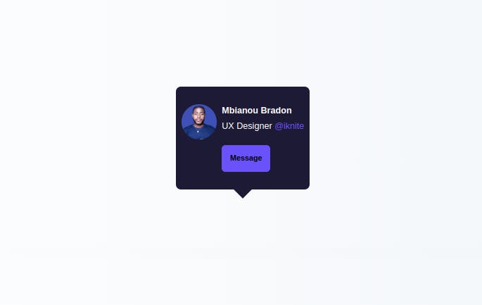
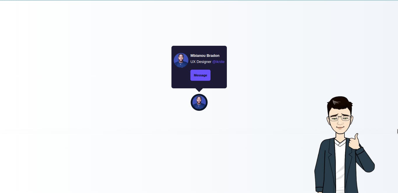
For this tutorial section, we will be building a Profile tooltip, such that on hover, it gives you more details on the profile image being hovered.
This kind of Tooltip is can be seen on Twitter, where when a user hovers over another user's profile picture, a tooltip is shown giving more details about the user whose profile image is being hovered.
Understanding the task
A tooltip isn't a complex task to do, we will be doing this work in 2 separate parts. The User Profile, and the Profile Tooltip.
Structure of Code
Our code structure is basic and straightforward.
<body>
    <div>
            <!-- Profile Tooltip -->
                <div></div>

            <!-- User Profile Picture-->
                <div></div>

    </div>
</body>
We basically have the User profile picture, from which the tooltip will show and we have the tooltip code itself.
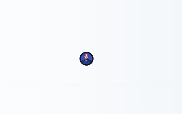
User Profile Picture
            <!-- Profile Tooltip -->
<div id="profile" class="cursor-pointer active:scale-95">
   <div class="h-16 w-16 rounded-full overflow-hidden p-1.5 bg-slate-900">
     <img src="https://res.cloudinary.com/practicaldev/image/fetch/s--4JL5abHt--/c_fill,f_auto,fl_progressive,h_320,q_auto,w_320/https://dev-to-uploads.s3.amazonaws.com/uploads/user/profile_image/1035172/ddd0c7d5-5a6b-4191-b822-02745bea888d.png" alt="" class="rounded-full aspect-square object-center object-cover">
    </div>
</div>
We have a container with id="profile", which scale-95 when active.
We gave the image container a width and height of w-16 and h-16 respectively, a border-radius of rounded-full. To make the image responsive, we gave it an aspect-square object-center and object-cover.
That's all for this part.
Profile Tooltip
            <!-- User Profile Picture-->
<div id="tooltip" class="hidden absolute -top-[11.5rem] bg-[#1d1a36] rounded-lg">
  <div class="max-w-[20rem] flex gap-2 px-2 py-7 text-sm relative before:absolute before:content-[''] before:w-5 before:h-5 before:rotate-45 before:bg-[#1d1a36] before:-bottom-2.5 before:left-[45%]">
    <div class="h-14 w-14 rounded-full overflow-hidden">
       <img src="https://res.cloudinary.com/practicaldev/image/fetch/s--4JL5abHt--/c_fill,f_auto,fl_progressive,h_320,q_auto,w_320/https://dev-to-uploads.s3.amazonaws.com/uploads/user/profile_image/1035172/ddd0c7d5-5a6b-4191-b822-02745bea888d.png" alt="" class="aspect-square object-center object-cover">
    </div>

    <div>
      <div class="mb-5">
        <h2 class="font-semibold text-[14px]">Mbianou Bradon</h2>
        <p class="mt-1">UX Designer <span class="text-[#6952f9]">@iknite</span></p>
       </div>

       <div id="out" class="cursor-pointer text-center w-fit px-3 py-3 bg-[#6952f9] text-xs font-semibold border border-[#6952f9] hover:bg-white hover:text-[#6952f9] active:scale-95 rounded-md"><h2>Message</h2></div>
    </div>

  </div>
</div>
The main container has an id="tooltip", for easy referencing at the level of the javascript file.
The container is positioned absolute and placed where it is supposed to be using -top-[11.5rem]
The content of this container is principally the profile image, the User's name and details like what he does.
Styles applied here are basic styling such as padding-inline of px, padding-block of py, border-radius of rounded-full and font-weight of font-semibold
Extra Styling
We also gave some extra styling to the main container holding everything together, and to the body of the page
<body class="bg-gradient-to-r from-[#8875d5] to-[#423b87] flex items-center justify-center min-h-screen">
    <div class="w-full max-w-lg relative mt-10 flex justify-center">
            <!-- Profile Tooltip -->
                <div></div>

            <!-- User Profile Picture-->
                <div></div>

    </div>
</body>
And this should be all for the HTML and TailwindCSS sections.
Now let's jump into our JavaScript file.
JavaScript
const tooltip = document.getElementById('tooltip')
const profile = document.getElementById('profile')

profile.addEventListener('mouseover', () => {
    tooltip.classList.toggle('hidden')
})

profile.addEventListener('mouseout', () => {
    tooltip.classList.toggle('hidden')

})
Yeah! That's all about the javascript code. On mouseover, the TailwindCSS property "hidden" is toggle, to display the tooltip, and on mouse out, it is toggled back to hide the tooltip.
On this note, we conclude this section.
Conclusion
We just built a Beautiful and simple tooltip Component
Many employers will need such components to be added to their websites, and for sure you know how simple it is to create it straight from your HTML document.
You can have a Live preview on Codepen or find the code on GitHub
Don’t hesitate to share with me if you were able to complete the tutorial on your end.
If you have any worries or suggestions, don’t hesitate to bring them up! 😊
See ya! 👋