Table of contents
A search box, search field or search bar is a graphical control element used in computer programs, such as file managers or web browsers, and on websites. A search box is usually a single-line text box or search icon (which will transform into a search box on click activity) with the dedicated function of accepting user input to be searched for in a database. Search boxes on web pages are usually used to allow users to enter a query to be submitted to a Web search engine server-side script, where an index database is queried for entries that contain one or more of the user's keyword research.
Search boxes are commonly accompanied by a search button (sometimes indicated only by a magnifying glass symbol) to submit the search. However, the search button may be omitted as the user may press the enter key to submit the search, or the search may be sent automatically to present the user with real-time results.
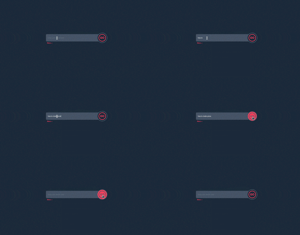
We are going to build this very useful component so that you can include it in your next application, project or even your portfolio website.

Understanding the task
As earlier described, a search box or search bar is just a single line or component structure used to easily find our required document, file or item within a large collection or table. As simple as the description is, so will be our code.
Let's dive in straight away
Structure of Code
We can structure our code thus
<body>

 <div>
  <div>
        <!--
                Content Goes Here

        -->

  </div>
 </div>

</body>
Having a clear idea of what the structure of our code looks like, let's build this search bar.
Search Bar
We will be building our code using a form element so that we will be able to send our request to a server easily (It also allows us to use our keyboard to send the request by pressing ENTER)
Our code looks like this
<form class="relative flex items-centers justify-center">
                    <!-- Input Field-->
     <input type="text" id="search" placeholder="Enter your search here" class="border-0 focus:ring-0 focus:outline-0 w-[60%] bg-slate-600 rounded-l-lg pl-4 text-sm text-slate-200">
                    <!-- Submit Button -->
       <button class="ring-4 ring-slate-600 ring-offset-[0.55rem] shadow-transparent ring-offset-slate-800 hover:ring-offset-rose-500  hover:bg-rose-500 bg-transparent rounded-[50%] active:scale-95 cursor-pointer">
         <h2 class="rounded-full border-4 border-rose-500 w-16 h-16  text-rose-500 text-2xl text-center justify-center flex items-center font-semibold hover:border-slate-600 hover:text-slate-600">GO</h2>
      </button>
                    <!-- Filter -->
      <div class="absolute -bottom-8 left-[17%] text-sm flex border-0 focus:outline-0 focus:ring-0 text-rose-500 mt-1 cursor-pointer">
             <h2>filters</h2>
             <div class="text-lg">
          <iconify-icon icon="material-symbols:keyboard-arrow-down-rounded"></iconify-icon>
            </div>
     </div>
</form>
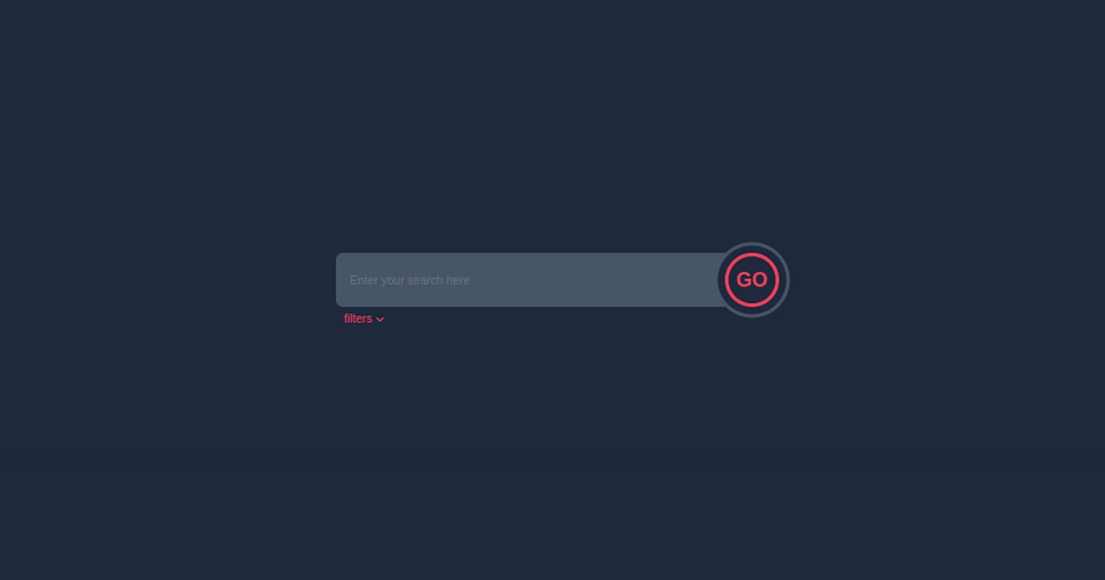
So our search bar as a whole is made up of an input field, a submit button and optionally a filter option.
Let's focus on the main parts, which are the input field and the submit button.
To the input field, we remove all the default styling using border-0 focus:ring-0 focus:outline-0. In addition, we gave it a width of w-[60%], a background-color of bg-slate-600, a border-inline-start-radius of rounded-l-lg, and we push the input text a little bit inside with a padding-inline-start of pl-4, and we made it smaller with a font-size of text-sm and text color text-slate-200.
                    <!-- Input Field-->
     <input type="text" id="search" placeholder="Enter your search here" class="border-0 focus:ring-0 focus:outline-0 w-[60%] bg-slate-600 rounded-l-lg pl-4 text-sm text-slate-200">
To the submit button, we somehow made it in a two-layer form, the first one is the submit button itself and the inner layer is an h2 element. This is just to give that double circle effect, so it is purely decorative.
                    <!-- Submit Button -->
       <button class="ring-4 ring-slate-600 ring-offset-[0.55rem] shadow-transparent ring-offset-slate-800 hover:ring-offset-rose-500  hover:bg-rose-500 bg-transparent rounded-[50%] active:scale-95 cursor-pointer">
         <h2 class="rounded-full border-4 border-rose-500 w-16 h-16  text-rose-500 text-2xl text-center justify-center flex items-center font-semibold hover:border-slate-600 hover:text-slate-600">GO</h2>
      </button>
To the inner layer, that's the h2 tag, we gave it some nice stylings, that's a border-radius of rounded-full, a height and width of h-16 and w-16 respectively, a font-size of text-2xl, a color of text-rose-600, border-width and color of border-4 border-rose-500. We centered the text inside making this element a flexbox using flex justify-center items-center. Also, on hover, the border-color changes to border-slate-600 and the text color to text-slate-600
Now, moving outward to the button itself, we gave it a ring and ring color of ring-4 ring-slate-600, also, we gave it a ring-offset-[0.55rem]. On hover, the background-color changes from bg-transparent to bg-rose-500
We can say that's pretty much it for this two.
The form element container these two pieces were made a flexbox and were centered.
For the filter option, though optional, let's talk about its styling,
                    <!-- Filter -->
      <div class="absolute -bottom-8 left-[17%] text-sm flex border-0 focus:outline-0 focus:ring-0 text-rose-500 mt-1 cursor-pointer">
             <h2>filters</h2>
             <div class="text-lg">
          <iconify-icon icon="material-symbols:keyboard-arrow-down-rounded"></iconify-icon>
            </div>
     </div>
It was positioned absolutely to the parent container and was placed at the position where it is using -bottom-8 and left-[17%], the icon use there is from iconify
And that's pretty much it.
The whole code looks like this
<body class="bg-slate-800 flex items-center justify-center min-h-screen [&_*]:transition-all [&_*]:ease-linear [&_*]:duration-150">
    <div class="w-full max-w-3xl">
        <div>
            <form class="relative flex items-centers justify-center">
                <input type="text" id="search" placeholder="Enter your search here" class="border-0 focus:ring-0 focus:outline-0 w-[60%] bg-slate-600 rounded-l-lg pl-4 text-sm text-slate-200">
                <button class="ring-4 ring-slate-600 ring-offset-[0.55rem] shadow-transparent ring-offset-slate-800 hover:ring-offset-rose-500  hover:bg-rose-500 bg-transparent rounded-[50%] active:scale-95 cursor-pointer">
                    <h2 class="rounded-full border-4 border-rose-500 w-16 h-16  text-rose-500 text-2xl text-center justify-center flex items-center font-semibold hover:border-slate-600 hover:text-slate-600">GO</h2>
                </button>

                <div class="absolute -bottom-8 left-[17%] text-sm flex border-0 focus:outline-0 focus:ring-0 text-rose-500 mt-1 cursor-pointer">
                    <h2>filters</h2>
                    <div class="text-lg">
                        <iconify-icon icon="material-symbols:keyboard-arrow-down-rounded"></iconify-icon>
                    </div>
                </div>
            </form>
        </div>
    </div>

    <script src="https://code.iconify.design/iconify-icon/1.0.3/iconify-icon.min.js"></script>
</body>

Conclusion
The wonderful thing about Building UI is that there’s not only one way to build a component.
For example in this situation, we made use of a form element, and someone else will use a different approach, don't hesitate to try a different way and share it with us
You can have a Live preview on Codepen or find the code on GitHub of what we just built.
If you have any worries or suggestions, don’t hesitate to leave them in the comment section! 😊
See ya! 👋
