Table of contents
Being part of the digital era, most of our physical businesses or services are now available online. In fact, we usually enjoy some services that are only available online.
To benefit from this service, we are generally required to Sign Up for it. Which is in most cases, creating an account on the site.
By definition, A sign-up form, is a web page, popup, or modal where users enter the information required to access that website’s services.
Some companies have grown and evolved to a point where they are very renounced and known by most if not all. These companies can be used as third-party services to register on other platforms, Such company includes; Google, Facebook, Twitter, GitHub etc.
In this section, we are going to build a Sign In UI component, that can be used for third-party Authentication.

Understanding the Task
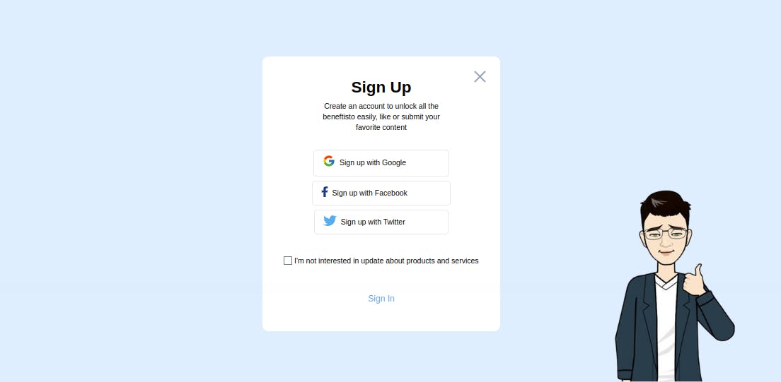
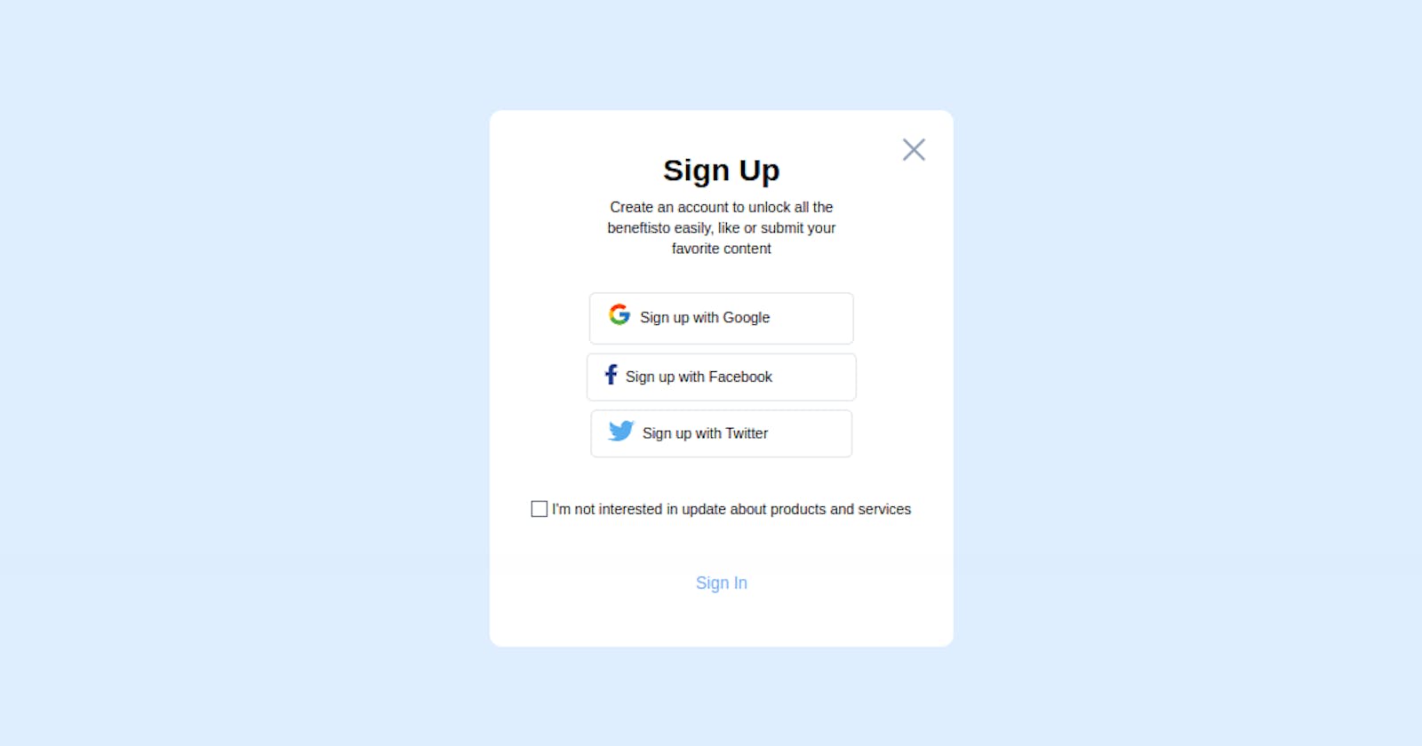
We are required to build a Signup component using third parties, we will be using Google, Facebook and Twitter for this example.
It is important to note that this is just UIs, so no underline logic
Structure of Code
Here is how our code looks like
<body class="bg-[#dfeeff] flex items-center justify-center min-h-screen">
<!-- First Layer -->
    <div class="w-full sm:max-w-md bg-white text-center px-10 pt-5 pb-10 relative rounded-xl [&_*]:transition-all [&_*]:ease-linear [&_*]:duration-200">
<!-- Second Layer -->
        <div>
                    <!-- Cross Icon -->
            <div class="text-4xl text-slate-400 top-5 right-5 absolute cursor-pointer"><iconify-icon icon="radix-icons:cross-2"></iconify-icon></div>
                    <!-- Header -->
            <div class="mt-5 mb-8">
                <h2 class="text-3xl font-bold mb-2">Sign Up</h2>
                <p class="text-sm w-[70%] mx-auto">Create an account to unlock all the beneftisto easily,
                     like or submit your favorite content
                </p>
            </div>
                    <!-- Third Parties -->
            <div class="[&>*]:flex [&>*]:items-center [&>*]:w-fit [&>*]:rounded-md [&>*]:border [&>*]:pl-4 [&>*]:pr-20 [&>*]:py-2 [&>*]:mx-auto [&>*]:my-2 [&>*]:text-sm [&>*:hover]:bg-[#dfeeff] [&>*]:cursor-pointer">
                <div>
                    <div class="text-2xl mr-2">
                        <iconify-icon icon="flat-color-icons:google"></iconify-icon>
                    </div>
                    <div>Sign up with Google</div>
                </div>

                <div>
                    <div class="text-xl text-blue-900 mr-2">
                        <iconify-icon icon="fa-brands:facebook-f"></iconify-icon>
                    </div>
                    <div>Sign up with Facebook</div>
                </div>

                <div>
                    <div class="text-xl mr-2">
                        <iconify-icon icon="logos:twitter"></iconify-icon>
                    </div>
                    <div>Sign up with Twitter</div>
                </div>
            </div>

            <div class="flex items-center gap-1 my-10">
                <input type="checkbox" >
                <p class="text-sm">I'm not interested in update about products and services</p>
            </div>
                    <!-- Sign Buttons -->
            <div class="text-blue-400 border border-transparent px-4 py-2 w-fit mx-auto rounded-md cursor-pointer hover:bg-blue-400 hover:text-white"><h2>Sign In</h2></div>
        </div>
    </div>

<script src="https://code.iconify.design/iconify-icon/1.0.2/iconify-icon.min.js"></script>
</body>
Before explaining the whole code, it is worth saying that you can get all the icons used in this tutorial are from iconify
- Header
To the header, we gave font-size of text-3xl for the upper header, and font-size of text-sm and a width of w-[70%] for the lower header. To the container holding everything we gave it a margin-block-start of mt-5 and a margin-block-end of mb-8
- Third Parties
We grouped all the different signup third parties in the same container and applied to each of them the same stylings. This was possible through the TailwindCSS properties [&>*].
If you are used to my posts, by now you surely know the meaning of [&>*] in tailwindcss.
But if you are new, The property [&>*] simply means “select each child individually”, this allows us to apply the same styling properties to all the immediate children.
To each child, we gave them a display of flex and align-items of items-center. We also gave it a width of w-fit, border-radius of rounded-md, padding-inline-start of pl-4, padding-inline-end of pr-20, padding-block of py-2. Lastly, we gave it a margin-block of my-2 and a hover effect which changes the background-color [&>*:hover]:bg-[#dfeeff]
To all the icons, we gave a font-size of text-2xl
- Sign Up Button
                    <!-- Sign Buttons -->
<div class="text-blue-400 border border-transparent px-4 py-2 w-fit mx-auto rounded-md cursor-pointer hover:bg-blue-400 hover:text-white">
        <h2>Sign In</h2>
</div>
For this SignUp Button, We gave it a text color of text-blue-400, a border-width that is initially transparent. We gave it a padding-inline of px-4, padding-block of py-2, border-radius of rounded-md and background-color changes on hover to hover:bg-blue-500
And that's principally it for the whole tutorial.

Conclusion
We just built a simple and responsive Sign Up with Third Parties component without😃.
You can have a Live preview on Codepen or find the code on GitHub
Don’t hesitate to share with me if you were able to complete the tutorial on your end, I’d be happy to see any additions styling you added to your card.
If you have any worries or suggestions, don’t hesitate to leave them in the comment section! 😊
See ya! 👋
