

Alert messaging (or alert notification) is machine-to-person communication that is important or time-sensitive. An alert may be a calendar reminder or a notification of a new message.
This tutorial will be quite fast and easy. Without taking too much time, let's jump right in and build a fully responsive alert message generator

Understanding the task
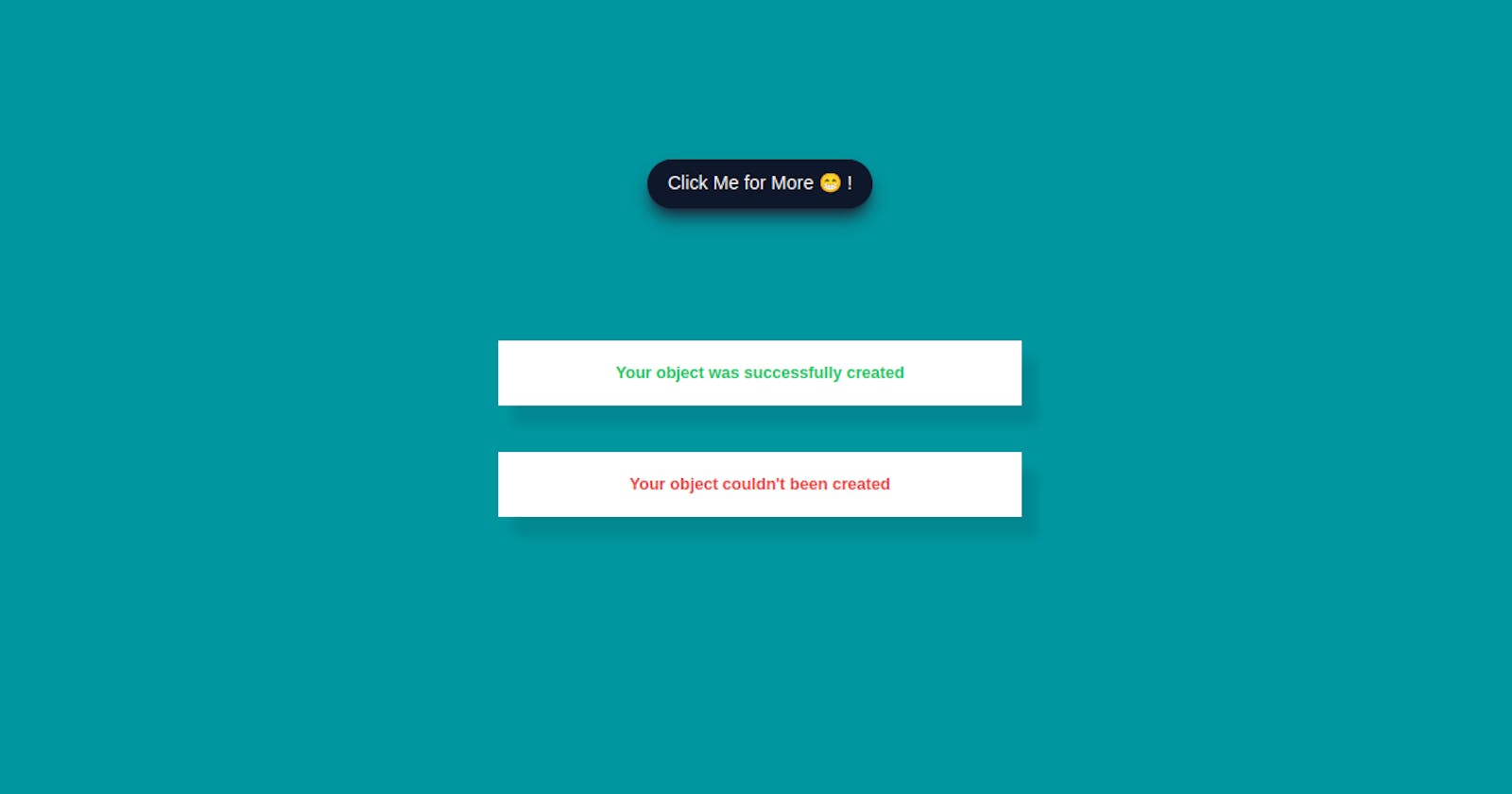
We are required to build an alert message generator, these alerts are generated when triggered.
For now, we will be restricting our messages to either "Your object was successfully created" or "Your object couldn't be created"
And to make it fun, we will make it random. That's we won't know which alert is generated at a given moment. We will leave random() to do the work.
Structure of Code
We will dive our work into 2 main parts, the UI, where the alerts are rendered, and the Logic, where the random alerts are produced.
Let's get started with the UI first. We will be building it using HTML and of course TailwindCSS.
UI (HTML and TailwindCSS)
The UI of the alert is very simple, it consists of a message, and icons (The icons are just to make it look beautiful, it is very optional)
Here is how our code looks like
<body class="bg-[#00969f] flex items-center justify-center min-h-screen [&_*]:transition-all [&_*]:ease-linear">
<div id="root" class="flex flex-col items-center gap-10 w-full px-3 sm:px-0">
<div class="w-full max-w-md bg-white shadow-[0.8rem_1rem_0.5rem_rgba(0,0,0,0.1)]">
<div class="flex items-center justify-between px-4 py-4 gap-2">
<div class="text-green-500 text-2xl"><svg xmlns="http://www.w3.org/2000/svg" width="1em" height="1em" viewBox="0 0 24 24"><path fill="currentColor" d="M12 2C6.5 2 2 6.5 2 12s4.5 10 10 10s10-4.5 10-10S17.5 2 12 2m-2 15l-5-5l1.41-1.41L10 14.17l7.59-7.59L19 8l-9 9Z"/></svg></div>
<h2 class="text-sm text-green-500 font-semibold">Your object was successfully created</h2>
<div class="close"><iconify-icon class="text-2xl text-slate-300 hover:text-slate-500 hover:scale-110 rounded cursor-pointer mt-1" icon="system-uicons:cross"></iconify-icon></div>
</div>
</div>
<div class="w-full max-w-md bg-white shadow-[0.8rem_1rem_0.5rem_rgba(0,0,0,0.1)]">
<div class="flex items-center justify-between px-4 py-4 gap-2">
<div class="text-red-500 text-2xl"><svg xmlns="http://www.w3.org/2000/svg" width="1em" height="1em" viewBox="0 0 16 16"><g fill="none" stroke="currentColor" stroke-linecap="round" stroke-linejoin="round" stroke-width="1.5"><path d="m10.25 5.75l-4.5 4.5m0-4.5l4.5 4.5"/><circle cx="8" cy="8" r="6.25"/></g></svg></div>
<h2 class="text-sm text-red-500 font-semibold">Your object couldn't been created</h2>
<div class="close"><iconify-icon class="text-2xl text-slate-300 hover:text-slate-500 hover:scale-110 rounded cursor-pointer mt-1" icon="system-uicons:cross"></iconify-icon></div>
</div>
</div>
</div>
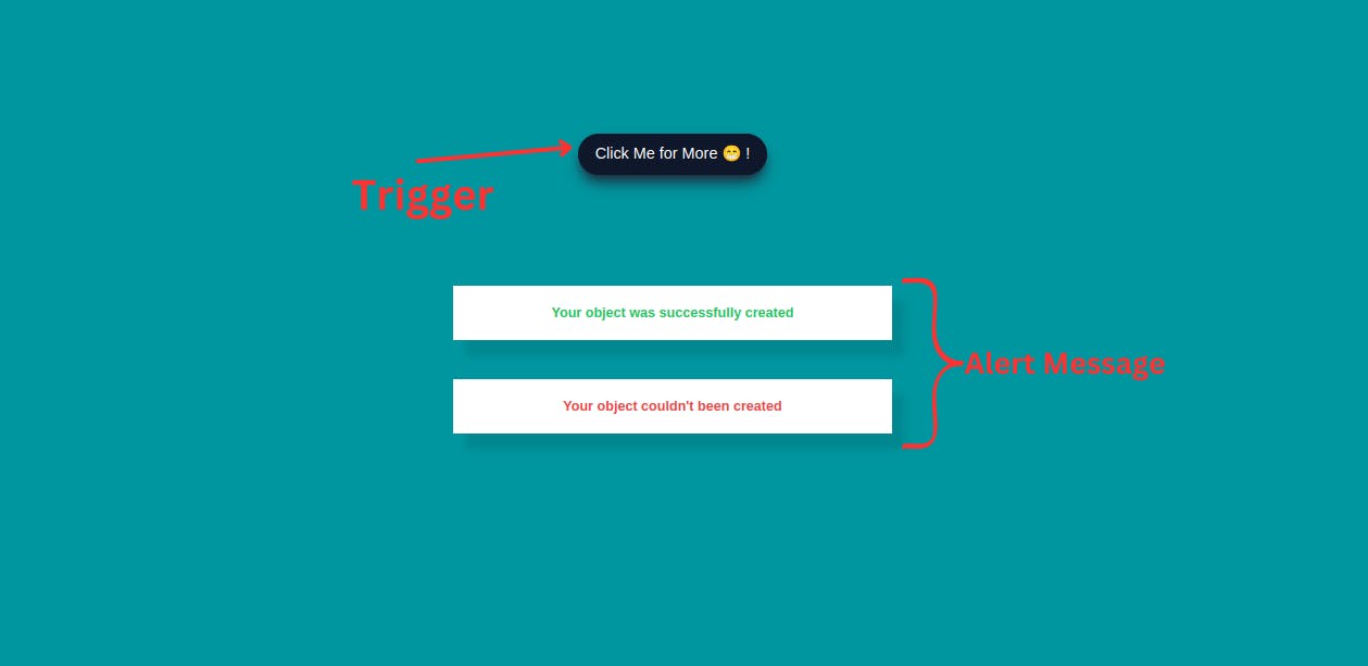
<div id="newAlert" class="absolute top-[20%] bg-slate-900 hover:bg-white border border-slate-900 shadow-lg shadow-slate-800 px-4 py-2 rounded-full text-center text-white hover:text-slate-800 cursor-pointer active:scale-90"><h2>Click Me for More 😁 !</h2></div>
<div id="cool" class="absolute top-[12.4%] hidden"><p class="text-sm relative text-white bg-slate-900 px-4 py-2 rounded before:content-[''] before:w-3 before:h-3 before:bg-slate-900 before:absolute before:rotate-45 before:-bottom-1 before:left-1/2">Bradon! Your coding Buddy😎</p></div>
<script src="https://code.iconify.design/iconify-icon/1.0.2/iconify-icon.min.js"></script>
<script src="index.js"></script>
</body>
In this UI, we have 2 alerts, each for the different types of alerts earlier mentioned.
So explaining one automatically applies to the other.
Let's choose the Positive Message alert
                        <!-- Alert Container -->
<div class="w-full max-w-md bg-white shadow-[0.8rem_1rem_0.5rem_rgba(0,0,0,0.1)]">
                        <!-- Tick icon -->
     <div class="flex items-center justify-between px-4 py-4 gap-2">
     <div class="text-green-500 text-2xl"><svg xmlns="http://www.w3.org/2000/svg" width="1em" height="1em" viewBox="0 0 24 24"><path fill="currentColor" d="M12 2C6.5 2 2 6.5 2 12s4.5 10 10 10s10-4.5 10-10S17.5 2 12 2m-2 15l-5-5l1.41-1.41L10 14.17l7.59-7.59L19 8l-9 9Z"/></svg></div>
                        <!-- Alert Message -->
    <h2 class="text-sm text-green-500 font-semibold">Your object was successfully created</h2>
                             <!-- Cross icon -->
<div class="close"><iconify-icon class="text-2xl text-slate-300 hover:text-slate-500 hover:scale-110 rounded cursor-pointer mt-1" icon="system-uicons:cross"></iconify-icon></div>
            </div>

</div>
So our alert message has 2 things, 2 icons and the alert message itself.
For the icons, you can get them at iconify
The styles applied here are, to the main alert container, we gave it a width of w-full and a max-width of max-w-md, a background-color of bg-white and a box-shadow of shadow-[0.8rem_1rem_0.5rem_rgba(0,0,0,0.1)]
For the tick icon, we just gave it a font-size of text-2xl and color of text-green-500 (For the positive alert message)
The alert message itself has a font-size of text-sm, font-weight of font-semibold
And for the cross icon, we gave it a font-size of text-2xl, a color of text-slate-300 which changes to hover:text-slate-500 on hover and also scale to scale-110 border-radius of rounded and cursor of cursor-pointer
That's quite it for the UI. Now we can work on the trigger
<div id="newAlert" class="absolute top-[20%] bg-slate-900 hover:bg-white border border-slate-900 shadow-lg shadow-slate-800 px-4 py-2 rounded-full text-center text-white hover:text-slate-800 cursor-pointer active:scale-90"><h2>Click Me for More 😁 !</h2></div>
This is the button you click to generate new alert messages.
We gave it an id="newAlet", and we position it absolutely at the top using absolute top-[20%]. We styled it by giving a background-color of bg-slate-900, which changes to bg-white on hover:bg-white with a box-shadow of shadow-slate-800 , a padding-inline of px-4, padding-block py-2 and border-radius of rounded-full
Logic (JavaScript)
This is where the new alerts are randomly generated and sent to the front through the root, (Container with id="root").
const root = document.getElementById('root')
const newAlert = document.getElementById('newAlert')
const close = document.querySelectorAll(".close")
const tooltip = document.getElementById("cool");

const moreAlert = [
    {
     color : 'green-500',
     textMessage : `Your object was successfully Created !`,
     icon : `<svg xmlns="http://www.w3.org/2000/svg" width="1em" height="1em" viewBox="0 0 24 24"><path fill="currentColor" d="M12 2C6.5 2 2 6.5 2 12s4.5 10 10 10s10-4.5 10-10S17.5 2 12 2m-2 15l-5-5l1.41-1.41L10 14.17l7.59-7.59L19 8l-9 9Z"/></svg>`
    },
    {
        color : `red-500`,
        textMessage : "Your object couldn't be Created !",
        icon : `
        <svg xmlns="http://www.w3.org/2000/svg" width="1em" height="1em" viewBox="0 0 16 16"><g fill="none" stroke="currentColor" stroke-linecap="round" stroke-linejoin="round" stroke-width="1.5"><path d="m10.25 5.75l-4.5 4.5m0-4.5l4.5 4.5"/><circle cx="8" cy="8" r="6.25"/></g></svg>`
    }
]

newAlert.addEventListener("click", () => {
    generateAlert();
    tooltip.classList.add("hidden")
});

function generateAlert(givenAlert) {
    const div = document.createElement("div");

    const type = givenAlert || moreAlert[Math.floor(Math.random() * moreAlert.length)];

    div.className = `w-full max-w-md bg-white shadow-[0.8rem_1rem_0.5rem_rgba(0,0,0,0.1)] opacity-100 transition`;
    console.log(type);
    div.innerHTML = `
        <div class="flex items-center justify-between px-4 py-4 gap-2">
            <div class="text-${type.color} text-2xl mt-1">${type.icon}</div>
            <h2 class="text-sm text-${type.color} font-semibold">${type.textMessage}</h2>
            <div><iconify-icon class="text-2xl text-slate-300 hover:text-slate-500 hover:scale-110 rounded cursor-pointer mt-1" icon="system-uicons:cross"></iconify-icon></div>
        </div>
    `;

    root.appendChild(div);

    setTimeout(() => {

        div.classList.remove("opacity-100");
        div.classList.add("opacity-0")

        setTimeout(() => {
            div.remove();
        }, 1000)

    }, 3000);
}

close.forEach((remove) => {
  remove.addEventListener('click', () => {
    remove.parentNode.remove();
  });
})


newAlert.addEventListener("mouseenter", ()=>{
    tooltip.classList.remove("hidden")
})


newAlert.addEventListener("mouseleave", ()=>{
    tooltip.classList.add("hidden")
})
Each alert message is an object stored in the moreAlert array. As earlier mentioned, we just have 2 main objects, a positive and a negative alert.
We started by defining our variables at the top of the file.
Each new alert is generated by the generateAlert(), this function generates a completely new HTML element and injects it into the document through the root.
It also has a setTimeout() which removes it after 3000ms (3s).
We added an event listener to newAlert, and on click, it generates a random alert message from the object array. (You can always customize your messages per your need)
And that's pretty much it for this tutorial.
Conclusion
We just built a very nice Alert Message using HTML, TailwindCSS and Javascript.
You can always customize it at your convenience, and of course share with us the different adjustments you did.
You can have a live preview on Codepen and have the source code on GitHub
Don’t hesitate to share with me if you were able to complete the tutorial on your end, I’d be happy to see any additional components and styling you added to your Countdown.
If you have any worries or suggestions, don’t hesitate to bring them up! 😊
See ya! 👋