

The term widget refers to any tool or content that you add, arrange or remove from the sidebar(s) of your blog — these are the blocks that make up your sidebar. It is very common in most blogs and other types of websites like E-learning platforms and e-commerce websites.
In this tutorial, we will be building different blog widgets like Tags, Recent Post and Search bar.
Without wasting too much time, let's get started.
Understanding the Task
In this session, we will be building three different commonly use blog widgets.
Tags
Recent Posts
Search
So we will be building each of these components separately using HTML and TailwindCSS.
Structure of Code
The structure of the code will be quite straightforward, let's go straight to the code
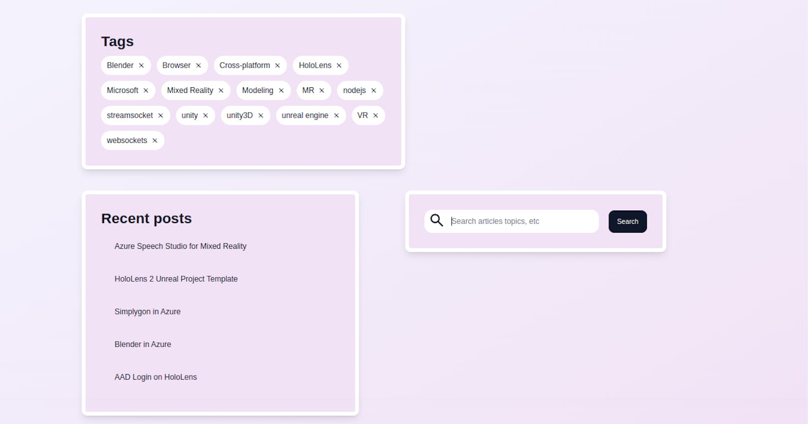
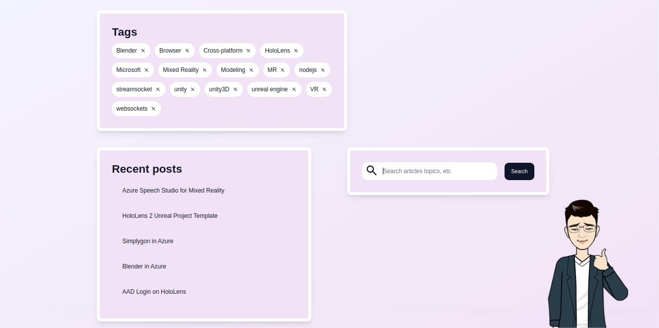
Tags
<div class="md:row-start-1 tags w-full max-w-2xl h-fit place-self-end">
     <div class="text-3xl font-bold mb-3"><h2>Tags</h2></div>
     <ul class="flex gap-3 flex-wrap [&>*]:bg-white [&>*]:px-3 [&>*]:py-2 [&>*]:rounded-full [&>*:hover]:bg-slate-900 [&>*:hover]:text-white [&>*>a]:flex [&>*>a]:items-center [&>*>a]:gap-2">
         <li><a href="">
             <h2>Blender</h2>
             <iconify-icon icon="system-uicons:cross"></iconify-icon>
             </a></li>

          <li><a href="">
              <h2>Browser</h2>
              <iconify-icon icon="system-uicons:cross"></iconify-icon>
              </a></li>

          <li><a href="">
              <h2>Cross-platform</h2>
              <iconify-icon icon="system-uicons:cross"></iconify-icon>
             </a></li>

          <li><a href="">
              <h2>HoloLens</h2>
              <iconify-icon icon="system-uicons:cross"></iconify-icon>
              </a></li>

           <li><a href="">
              <h2>Microsoft</h2>
              <iconify-icon icon="system-uicons:cross"></iconify-icon>
              </a></li>

           <li><a href="">
              <h2>Mixed Reality</h2>
              <iconify-icon icon="system-uicons:cross"></iconify-icon>
              </a></li>

           <li><a href="">
               <h2>Modeling</h2>
              <iconify-icon icon="system-uicons:cross"></iconify-icon>
              </a></li>

           <li><a href="">
               <h2>MR</h2>
              <iconify-icon icon="system-uicons:cross"></iconify-icon>
                </a></li>

           <li><a href="">
                <h2>nodejs</h2>
              <iconify-icon icon="system-uicons:cross"></iconify-icon>
                </a></li>

           <li><a href="">
               <h2>streamsocket</h2>
              <iconify-icon icon="system-uicons:cross"></iconify-icon>
                </a></li>

           <li><a href="">
                <h2>unity</h2>
              <iconify-icon icon="system-uicons:cross"></iconify-icon>
                </a></li>

           <li><a href="">
               <h2>unity3D</h2>
              <iconify-icon icon="system-uicons:cross"></iconify-icon>
                </a></li>

           <li><a href="">
               <h2>unreal engine</h2>
              <iconify-icon icon="system-uicons:cross"></iconify-icon>
                </a></li>

           <li><a href="">
               <h2>VR</h2>
              <iconify-icon icon="system-uicons:cross"></iconify-icon>
                </a></li>

           <li><a href="">
               <h2>websockets</h2>
              <iconify-icon icon="system-uicons:cross"></iconify-icon>
              </a></li>
            </ul>
        </div>
For the tags component, we made it in the form of an ordered list, in which the different list items are the different tags.
We applied general styling to them using the TailwindCSS property [&>*], at the level of the parent container.
The property [&>*] simply means “select each child individually”, this allows us to apply the same styling properties to all the immediate children.
To each of the list items, we gave a background-color of bg-white, a padding-inline of px-3, padding-block of py-2, also, we gave each of them a border-radius of rounded-full, we also gave them hover effects, on hover, the background-color changes to bg-slate-900 and the color of the text changes to text-white. Similarly, we targeted the a-tags within the list item and gave them a display of flex items-center gap-2
And this are the major styles given to the tags.

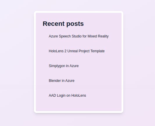
Recent Post Widget
The recent post widget is the quite easy, let's see how it looks like
<div class="md:row-start-2 recent-posts w-full max-w-xl h-fit">
    <div class="text-3xl font-bold"><h2>Recent posts</h2></div>
       <div class="[&>*:hover]:bg-white [&>*]:px-4 [&>*]:py-4 [&>*]:rounded-xl [&>*]:my-3 [&>*]:mx-3 [&>*]:cursor-pointer">
            <div>Azure Speech Studio for Mixed Reality</div>
            <div>HoloLens 2 Unreal Project Template</div>
            <div>Simplygon in Azure</div>
            <div>Blender in Azure</div>
            <div>AAD Login on HoloLens</div>
       </div>
</div>
This section styling isn't different from the one we use at the level of the Tags widget. we make use of [&>*] property.
To each post, we gave a a padding-inline of px-4, padding-block py-4, margin-block of my-3, also, we gave each of them a border-radius of rounded-xl, we also gave them hover effects, on hover, the background-color changes to bg-white
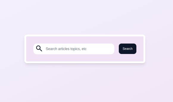
Search Bar
<div class=" md:row-start-2 search-bar w-full max-w-xl h-fit">
    <div class="flex items-center gap-5 flex-wrap">
        <div class="flex items-center bg-white rounded-2xl px-2">
            <div class="text-4xl mt-1">
  <iconify-icon icon="material-symbols:search-rounded"></iconify-icon>
            </div>
      <input type="text" placeholder="Search articles topics, etc" class="min-w-0 border-0 focus:border-0 focus:ring-0 focus:ring-offset-0 text-slate-900 sm:mr-20">
         </div>

      <div class="hover:bg-white hover:text-slate-900 text-sm px-4 py-3 rounded-xl border border-slate-900 bg-slate-900 text-white cursor-pointer">
           <h2>Search</h2>
       </div>
   </div>
</div>
The last blog widget component we will be working on in this session is the Sear bar components. we principally have an icon, an input field and a search button.
Styling here isn't any different from what we discuss already, you can definitely understand it.
And that's pretty it for this tutorial session.
Conclusion.
We just learned how to create Blog widgets. You have enough knowledge to make a personal widget for your Blog.
You can have a live preview on Codepen and have the source code on GitHub
Don’t hesitate to share with me if you were able to complete the tutorial on your end.
If you have any worries or suggestions, don’t hesitate to bring them up! 😊
See ya! 👋