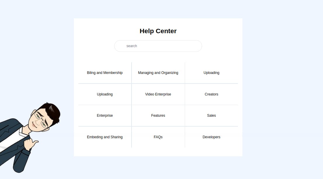
A Help Center is a website where customers can find answers to their questions and solutions to their problems. Designed to resolve many common queries that a brand receives, a Help Center should make it simple for customers to find the answers they’re looking for.
Good Help Centers are well organized and carefully presented, making it easy for customers to navigate the site and find what they’re searching for.
Help Centers should always be easily searchable, providing customers with an accessible version of a brand’s knowledge base that has been created with users in mind. The site will often incorporate FAQs, articles and a good variety of instructions, all of which should be of digestible length.
In this tutorial, we will be building a basic help center, that you can always use in your future project, or incorporate into your website.

Understanding the task
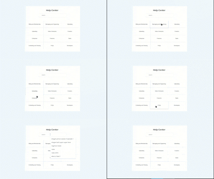
As earlier mentioned, a Help center is just a place where a customer can find the answer to all the questions s/he needs. S/he can do it in two possible ways, either through a search or through a predefined question.
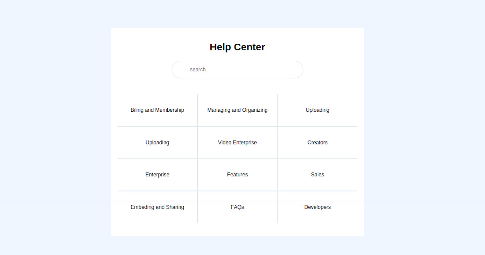
So our Help center will have 2 parts.
Search Bar
Defined Sections

Let's build this awesome component
Structure of Code
Our main Structure looks like this
<body>
<!-- First Layer -->
 <div>
<!-- Second Layer -->
  <div>
        <!--
              Here Goes the content
          -->
  </div>
 </div>

</body>
Let's start by Building the first part of the Help Center, that's the Search Bar and Header
Header And Search Bar
                        <!-- Header -->
<h2 class="text-3xl font-semibold text-center">Help Center</h2>

 <div class="w-[55%] flex items-center border rounded-full p-2 mt-6 mb-12 mx-auto">
                <!-- Search Icon -->
      <div class="w-[10%] bg-red-600"></div>
      <input type="text" name="search" class="w-full h-4/5 border-0 focus:border-0 focus:outline-none focus:ring-0" placeholder="search">
</div>
Very easy section, same as its styling. For the header, we gave it a font-size of text-3xl, font-weight of font-semibold and positioned it at the center using text-center
Going to the search bar, we use an input field and a div. We gave it the possibility to add an icon. For in this one we didn't include one
To the container holding the input field and icon, we gave it a width of w-[55%] the parent container, made it a flexbox with a border-radius of rounded-full
To the input field, we removed all predefined styles using border-0 focus:border-0 focus:outline-none focus:ring-0
And that is pretty much it for the first part

Defined Sections
These defined sections are usually links to already answered questions grouped into specific categories.
Here is how the code looks like
<div class="grid grid-cols-1 sm:grid-cols-2 md:grid-cols-3 gap-0.5 bg-slate-200 [&>*]:h-24 [&>*]:px-3 [&>*]:bg-white [&>*]:flex [&>*]:items-center [&>*]:justify-center [&>*]:cursor-pointer [&>*:hover]:scale-105 [&>*:hover]:shadow-sm [&>*:hover]:shadow-slate-800/80">
                <div><h2>Biling and Membership</h2></div>
                <div><h2>Managing and Organizing</h2></div>
                <div><h2>Uploading</h2></div>
                <div><h2>Uploading</h2></div>
                <div><h2>Video Enterprise</h2></div>
                <div><h2>Creators</h2></div>
                <div><h2>Enterprise</h2></div>
                <div><h2>Features</h2></div>
                <div><h2>Sales</h2></div>
                <div><h2>Embeding and Sharing</h2></div>
                <div><h2>FAQs</h2></div>
                <div><h2>Developers</h2></div>
</div>
Having a clear idea of the structure of our code, we gave general stylings to the different categories directly from their parent container.
To give this general style, we made use of the [&>*] property from TailwindCSS.
The property [&>*] simply means “select each child individually”, this allows us to apply the same styling properties to all the immediate children.
To each of the children, we gave the height of h-24, padding-inline of px-3. Also, we made each of them a flex container and centered their content using flex items-center justify-center . Hover effects were also added, on hover, the child scales and a shadow is added [&>*:hover]:scale-105 [&>*:hover]:shadow-sm [&>*:hover]:shadow-slate-800/80
For the main container holding this different category, we made it a grid container with 1 column on mobile screens, 2 columns on small screens and 3 columns from medium screens and above grid grid-cols-1 sm:grid-cols-2 md:grid-cols-3 gap-0.5

And that's pretty much it for this tutorial

Conclusion
We just built a Help Center Component 🤩. And I bet you realized it was very easy than we thought in the beginning 😏. We did all of this without any stress and without leaving our HTML file.
You can have a Live preview on Codepen or find the code on GitHub
Don’t hesitate to share with me if you were able to complete the tutorial on your end, I’d be happy to see any additional component and styling you added to your work
If you have any worries or suggestions, don’t hesitate to bring them up! 😊
See ya! 👋
